Tube Rank: Your Guide to Video Success
Discover tips and insights for optimizing your video presence.
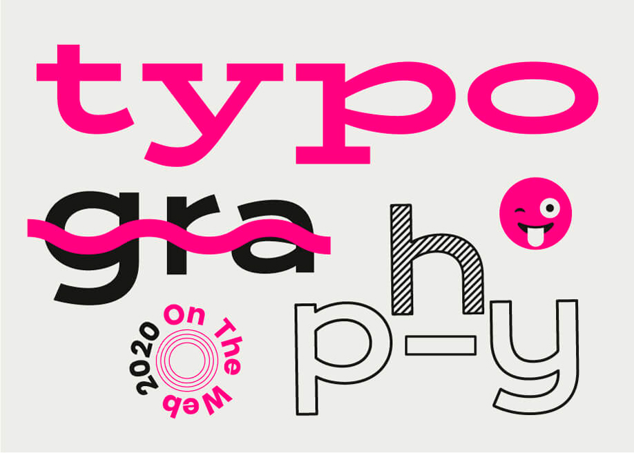
Type It Right: Transform Your Web Design with Typography
Unlock the secret to stunning web design! Discover how typography can elevate your site's look and feel in our latest blog post.
The Power of Typography: How Fonts Can Enhance Your Web Design
Typography is an often-overlooked aspect of web design that can significantly influence user experience. The choice of fonts not only affects the aesthetic appeal of a website but also its readability and overall functionality. For instance, pairing fonts effectively can create a visually cohesive look that guides readers’ eyes through the content. In a world where attention spans are short, a well-thought-out typography strategy can make a website stand out and resonate with visitors.
Beyond mere visual appeal, typography serves as a vital component of SEO as well. Search engines take into account how content is displayed, including fonts and formatting, when determining a site’s relevance and readability. By choosing web-safe fonts and ensuring that text is easily legible across devices, designers can enhance user engagement. Factors such as contrast, spacing, and hierarchy are crucial and can make visitors more likely to stay on your page, further boosting your site's performance in search rankings.

5 Typography Mistakes to Avoid for a Better User Experience
Typography plays a crucial role in enhancing user experience on your blog, yet many content creators overlook its importance. One common mistake is using overly decorative fonts that can distract readers from the message. Choose fonts that are legible and align with your brand's personality. Furthermore, using an inappropriate font size can make your content difficult to consume; aim for at least 16 pixels for body text to ensure readability across devices.
Another frequent typography error is inconsistent use of styles and weights. Maintaining a cohesive style across headers, subheaders, and body text helps create a visual hierarchy that guides users through your content. Establish a consistent typography scale with defined font sizes and weights for different levels of text. Additionally, ensure that there's enough contrast between text and background colors to improve accessibility; a minimum contrast ratio of 4.5:1 is recommended for body text.
Choosing the Right Font: Key Questions to Elevate Your Web Design
Choosing the right font is essential for effective web design, as it can significantly influence both the aesthetic and functionality of your site. Consider legibility first: Is the font easy to read on various devices and screen sizes? Ensure that the font size and line spacing enhance readability, especially for body text. Moreover, match the typography to your brand's personality; for instance, a modern tech company may opt for sleek sans-serif fonts, while a boutique might choose elegant serif styles. Assess the font hierarchy as well: Does the typeface you choose clearly differentiate between headings, subheadings, and body text?
Additionally, it's crucial to ask about web compatibility and licensing issues. Is the font web safe, or will it require additional loading times if it's a unique typeface? Consider using web fonts through services like Google Fonts or Adobe Fonts, which provide a vast selection of optimized typefaces. Finally, think about the emotional impact of the font. Different styles evoke different feelings; a playful font might hint at creativity, while a bold typeface can convey authority. Evaluate these aspects carefully to ensure that your choice elevates your web design and resonates with your audience.