Tube Rank: Your Guide to Video Success
Discover tips and insights for optimizing your video presence.
Chart-topping Secrets to Stunning Data Visuals
Unleash the power of data with eye-catching visuals! Discover chart-topping secrets that will elevate your presentations and grab attention.
5 Essential Principles for Creating Stunning Data Visuals
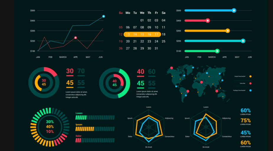
Creating stunning data visuals is an art that marries clarity and aesthetics. To start, one of the essential principles is to always prioritize clarity over complexity. Data visuals should convey information quickly and clearly, allowing your audience to grasp key insights without unnecessary distractions. Begin by decluttering your visuals. This can be achieved through minimalist design, which emphasizes only the most critical data. Use white space strategically to create balance and prevent overwhelming viewers with excessive information.
Another vital principle is to leverage the power of color effectively. Colors not only make your visuals more appealing but also enhance understanding. Choose a color palette that harmonizes with the data being presented. For instance, use contrasting colors to differentiate between categories, and stick to a limited number of colors to maintain cohesion. Additionally, employing charts and graphs that suit the data type—such as bar charts for comparisons or line graphs for trends—can also significantly elevate the effectiveness of your data presentations.

How to Choose the Right Chart Type for Your Data
Choosing the right chart type for your data is crucial for effective communication and analysis. Various factors influence this decision, including the nature of your data, the message you wish to convey, and your audience’s familiarity with different chart formats. Bar charts, for instance, are ideal for comparing quantities across categories, while line graphs effectively illustrate trends over time. To narrow down your options, consider the following criteria:
- Type of Data: Is your data categorical or numerical?
- Comparison: Are you comparing multiple groups or monitoring changes in one?
- Audience: Will your audience understand the chosen chart type?
Once you have assessed the type of data and the information you want to highlight, you can select a chart type that enhances comprehension. For instance, if you want to display the relationship between two variables, a scatter plot may be the most effective choice. Alternatively, if your goal is to represent a part-to-whole relationship, a pie chart or stacked bar chart could be more appropriate. Remember that clarity and simplicity should be your primary goals in visual data representation, so avoid overcomplicating your charts. By choosing the right chart type, you can ensure that your data is not only informative but also engaging for your audience.
Top Tools and Techniques for Designing Eye-Catching Infographics
Creating eye-catching infographics starts with utilizing the right tools. Here are some of the top tools that can transform your design process:
- Canva: A user-friendly graphic design platform that offers a plethora of templates specifically for infographics.
- Venngage: This tool provides customizable infographic templates and a vast library of icons and charts.
- Adobe Spark: Ideal for creating dynamic visuals, it allows users to blend images and text effortlessly.
- Piktochart: Perfect for both beginners and experienced designers, it offers easy-to-use features for crafting detailed infographics.
In addition to great tools, employing effective techniques is crucial for captivating your audience. Consider these techniques to enhance your infographic designs:
- Keep It Simple: Focus on delivering clear information without cluttering the design.
- Use a Cohesive Color Palette: Consistent colors can evoke emotions and improve readability.
- Focus on Layout: Ensure a logical flow of information by strategically placing elements on the canvas.
- Incorporate Visual Hierarchy: Use size and contrast to highlight the most important information.