Tube Rank: Your Guide to Video Success
Discover tips and insights for optimizing your video presence.
Data Visualization: Where Numbers Get a Glow-Up
Discover how data visualization transforms numbers into stunning visuals that captivate and inform. Elevate your data game today!
The Art of Storytelling with Data: Techniques for Effective Visualization
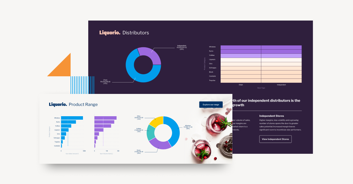
The art of storytelling with data lies in the ability to transform raw numbers into compelling narratives that captivate and inform your audience. Effective data visualization techniques play a crucial role in this process, allowing complex information to be communicated clearly and succinctly. Utilizing visual elements such as charts, graphs, and infographics not only enhances understanding but also engages viewers on an emotional level. Consider employing color psychology and selective emphasis to guide your audience’s attention and highlight critical insights within your data.
To master the art of storytelling with data, it is essential to follow a few key techniques:
- Know your audience: Tailor your visuals to the preferences and knowledge level of your target group.
- Establish a narrative: Construct a clear storyline to give context to the data, helping your audience to connect the dots.
- Use comparison: Implement side-by-side visuals that allow for easy comparison, helping to emphasize trends and changes.
- Keep it simple: Avoid clutter and focus on the main message, ensuring that your visuals are clean and easy to interpret.

5 Common Data Visualization Mistakes and How to Avoid Them
Data visualization is a powerful tool for conveying complex information, but several common mistakes can undermine its effectiveness. One of the most prevalent errors is the overcomplication of visualizations. When charts and graphs become cluttered with excessive information, it can overwhelm the audience and obscure the main message. To avoid this, aim for simplicity by focusing on the key data points necessary for your narrative. Use minimalist designs and ensure each element serves a clear purpose.
Another frequent pitfall in data visualization is the improper use of color. Using too many colors or hues can distract the viewer and lead to confusion. Instead, opt for a cohesive color palette that enhances clarity. Additionally, make sure to consider colorblind accessibility by using patterns or textures in conjunction with color to convey differences in data. By addressing these common mistakes, you can greatly improve the impact and comprehension of your visualizations.
How to Choose the Right Chart: A Guide to Data Visualization Types
Choosing the right chart is essential for effective data visualization. A well-selected chart can convey your message clearly, while an inappropriate one may confuse your audience or obscure critical insights. Here are some factors to consider when making your selection:
- Data Type: Understand whether you're dealing with categorical, continuous, or time-series data.
- Comparison: Decide if you need to show variations between different groups or track changes over time.
- Audience: Tailor your visualization to the expertise and preferences of your audience for better engagement.
With various data visualization types at your disposal, each has particular strengths. For instance, bar charts are excellent for comparing quantities, while line graphs effectively depict trends over periods. On the other hand, pie charts, although popular, should be used sparingly for comparing parts of a whole as they can be misleading if too many categories are involved. Always prioritize clarity over aesthetics when selecting a chart, ensuring that your audience grasps the intended message without confusion.