Tube Rank: Your Guide to Video Success
Discover tips and insights for optimizing your video presence.
Typography Tango: Dancing with Web Fonts
Unleash your creativity with Typography Tango! Discover the art of web fonts and transform your design game in just a few clicks!
The Ultimate Guide to Choosing Web Fonts for Your Website
Choosing the right web fonts for your website is crucial for creating a strong brand identity and enhancing the user experience. A well-selected font can improve readability, convey your brand's personality, and establish a visual hierarchy. When selecting fonts, consider web-safe fonts and how they render across different devices and browsers. Tools like Google Fonts or Adobe Fonts can provide a wide array of options that are optimized for web use. When making your choice, keep in mind the importance of legibility. Avoid overly decorative fonts that may be difficult to read, especially in smaller sizes.
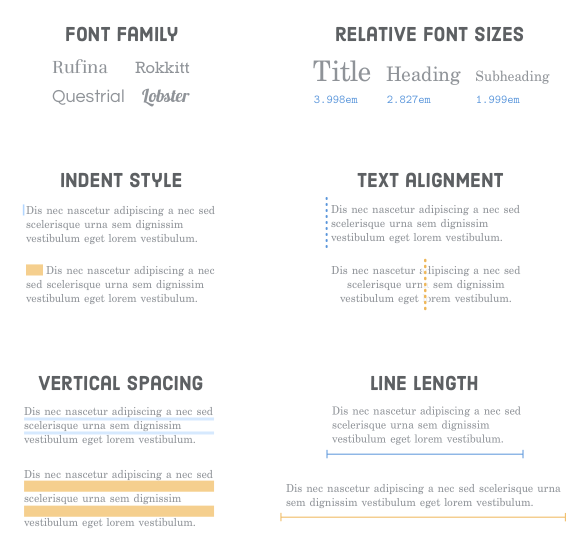
Another critical aspect to consider is font pairing. Combining fonts effectively can enhance your website's design while maintaining readability. A common practice is to choose a contrasting font for headings and body text. For instance, consider pairing a serif font for headings with a simple sans-serif font for body text. This contrast allows for a clear visual hierarchy and keeps the content engaging. Additionally, pay attention to font sizes and line spacing, as these elements play a significant role in how content is perceived on your site. Ultimately, the right combination of fonts not only improves aesthetics but also enhances overall user engagement.

How to Use Google Fonts to Enhance Your Website's Typography
Implementing Google Fonts on your website can significantly enhance its typography, making it more engaging and improving user experience. To get started, visit the Google Fonts website, where you'll find a vast library of free fonts to choose from. Once you've selected your desired font(s), click on the 'Select this style' button to generate a unique link that you can include in your website's <head> section. By loading these fonts directly from Google, you ensure faster loading times and responsive designs that adapt to various devices.
After linking your chosen Google Fonts, it's time to implement them into your CSS. You can do this by specifying the font family in your CSS file. For instance, to apply a specific font to all <h1> headings, you would write: h1 { font-family: 'YourChosenFont', sans-serif; }. Additionally, consider using font-weight and font-style properties for more customization. A thoughtful combination of different font weights and styles can make your text more appealing and easier to read, ultimately enhancing the overall aesthetic of your website.
What Makes a Great Web Font? Key Factors to Consider
Choosing the right web font plays a crucial role in enhancing the user experience and boosting the overall aesthetics of a website. Readability is one of the key factors to consider; a great web font should be easy to read on various devices and screen sizes. Designers often recommend using a font size of at least 16 pixels for body text and ensuring sufficient line-height for improved legibility. Additionally, contrast between the font color and background significantly affects readability. For instance, light text on a dark background or vice versa can help users read content more effortlessly.
Another vital aspect that contributes to a great web font is its versatility. A font that offers a range of weights, styles, and widths can help maintain visual consistency across different sections of a website. This versatility not only aids in creating a cohesive look but also allows for effective typographic hierarchy within the content. Furthermore, consider the loading time of web fonts; using optimized and web-safe fonts can prevent latency and ensure a smoother user experience. By prioritizing these factors, web designers can significantly elevate the overall design and functionality of their websites.